Alright, let’s dive into one of the most fun and impactful parts of building your brand: choosing your brand colors! It’s not just about picking what looks pretty, it’s about conveying visual emotion and illustrating the connection between you and your target audience. No pressure, right?
Don’t worry, we’ve got you covered. Whether you’re starting fresh or looking to revamp your palette, here’s your quick and easy guide to nailing your brand colors like a pro.
So let’s talk brand colors!
1. First Things First: Get to Know the Psychology of Colors
Colors speak. Seriously. Each one sparks a different feeling and perception in your audience. So, before you go color-crazy, think about what emotions you want your brand to stir up.
- Red: Energy, passion, and, yes, a little boldness.
- Orange: Creativity and fun. A real people-pleaser.
- Yellow: Hello, sunshine! Happiness, optimism, and clarity.
- Green: Growth, health, and tranquility—basically your nature-loving friend.
- Blue: Trustworthy, calm, and cool (just like that one person who never panics).
- Purple: Luxury, creativity, and a dash of mystery.
- Pink: Playful, compassionate, and full of warmth.
- Black: Elegant, powerful, and timeless.
- White: Clean, modern, and all about simplicity.
Pro Tip: Think about the message you want to send and match it to the right color vibe.heir goals.
2. Who’s Your Audience? (Because They Care About Colors Too)
Colors don’t just reflect your brand—they connect with your audience. And different people are drawn to different colors based on their vibe, age, and preferences.
- Health-conscious or eco-friendly folks usually love earth tones and greens (Mother Nature’s favorite palette).
- Younger audiences are drawn to bold, vibrant colors (bring on the neon and pop).
- Professional or luxury clients tend to lean toward more muted, sophisticated tones (navy, black, and gold = classy).
3. Bring Out Your Brand’s Personality
Your brand’s personality should shine through in every shade. Are you playful? Serious? Luxurious? Innovative? Your color choices should scream (or whisper) exactly what your brand is all about.
- Playful: Bright, contrasting colors—think pinks, yellows, and teals.
- Serious: Muted tones like navy, dark green, or maroon.
- Innovative: Bold and sleek, like deep charcoal with a splash of red or metallic.
Need help building out your brands personality?
SEE: TOP 5 WAYS TO GIVE YOUR BRAND PERSONALITY AND PURPOSE
4. Don’t Overthink. Keep It Simple.
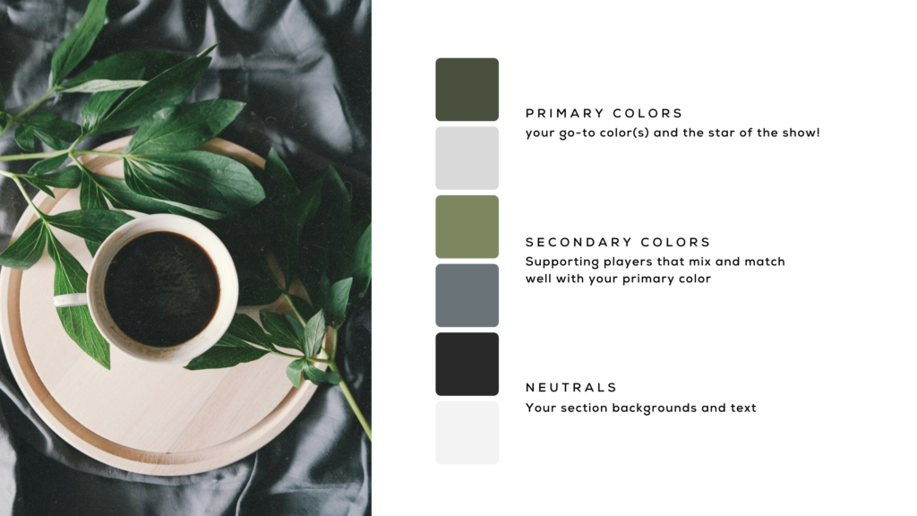
Let’s not overcomplicate things. Your palette doesn’t need to look like a box of crayons exploded. Stick to 3-5 key colors to keep your brand looking fresh and consistent.
- Neutral Color – Your background hero, like black, white, or a soft grey.
- Primary Color – This is your go-to color, the star of the show.
- Secondary Colors – Supporting players that mix and match well with your primary color.
5. Always Test Your Colors IRL
Before you fall in love with your brand-new color palette, test it. How do the colors look on a computer screen? Printed on a flyer? On your packaging or merchandise? You want colors that look good across all platforms.

Examples of a Strong Color Palette for a Wellness Spa
For our earthy, nature-inspired spa brand, we want to give off all the calm, organic vibes. So, here’s how that looks in practice:
Primary Colors
- Deep Forest Green: This is your go-to color that represents the calm and grounded nature of your brand. It embodies serenity and a deep connection to nature, creating an immediate sense of relaxation for your audience.
- Light Gray: This neutral supporting player balances out the richness of the primary color, adding lightness and a touch of modern simplicity to your branding.
Secondary Colors
- Slate Gray: A powerful and elegant neutral that works as a background or accent color, helping other elements of the design pop.
- Olive Green: A complementary green tone that works beautifully with the forest green, evoking a natural, earthy vibe. It adds depth while maintaining the overall tranquility of the palette.
Neutral Colors
- Granite + Soft White: Perfect for text and accents, this dark, grounding shade adds sophistication without overwhelming the palette.
These colors, when used together, reflect a soothing, natural aesthetic perfect for a wellness spa focused on tranquility and organic beauty.
Remember: You Got This! Choosing your brand colors isn’t just a visual thing… it’s a vibe, an emotion, and a connection with your audience. Whether you’re going bold and bright or soft and serene, don’t worry about what others are doing and keep it true to you and your brand’s personality.

Need a little branding boost? We are here for you! Contact us and we will be in touch.
